How Congress is Profiting from Palantir, and Vice-Versa
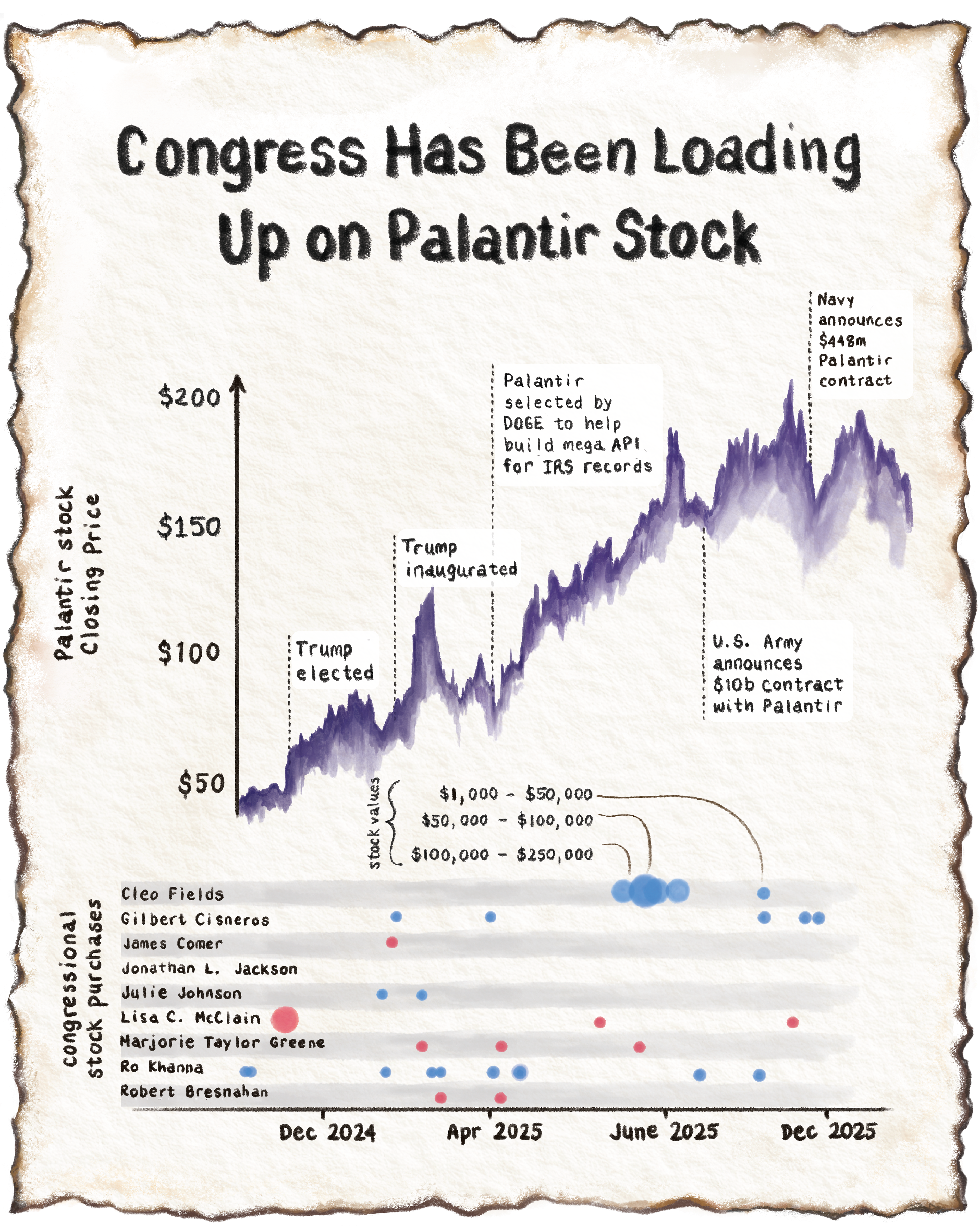
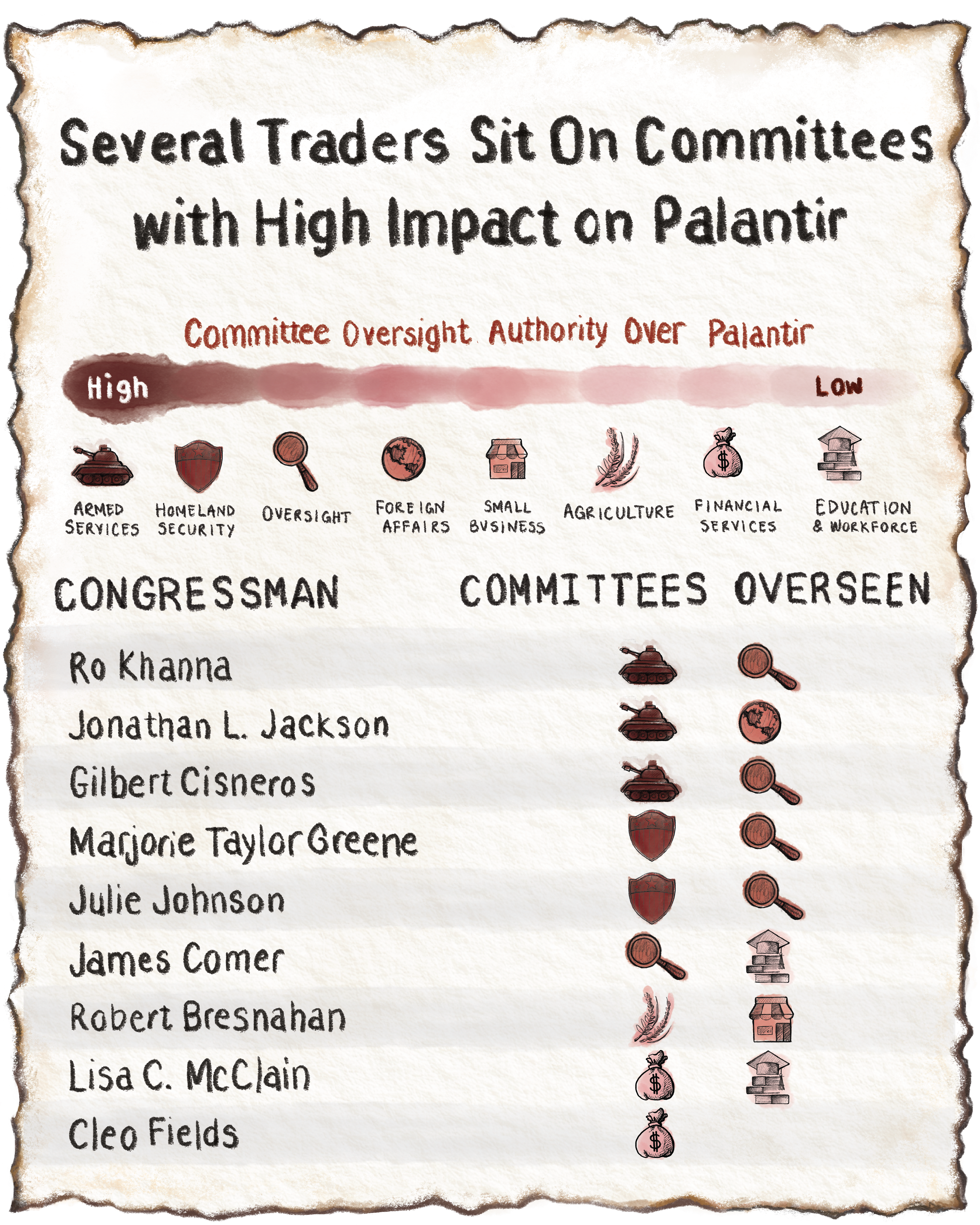
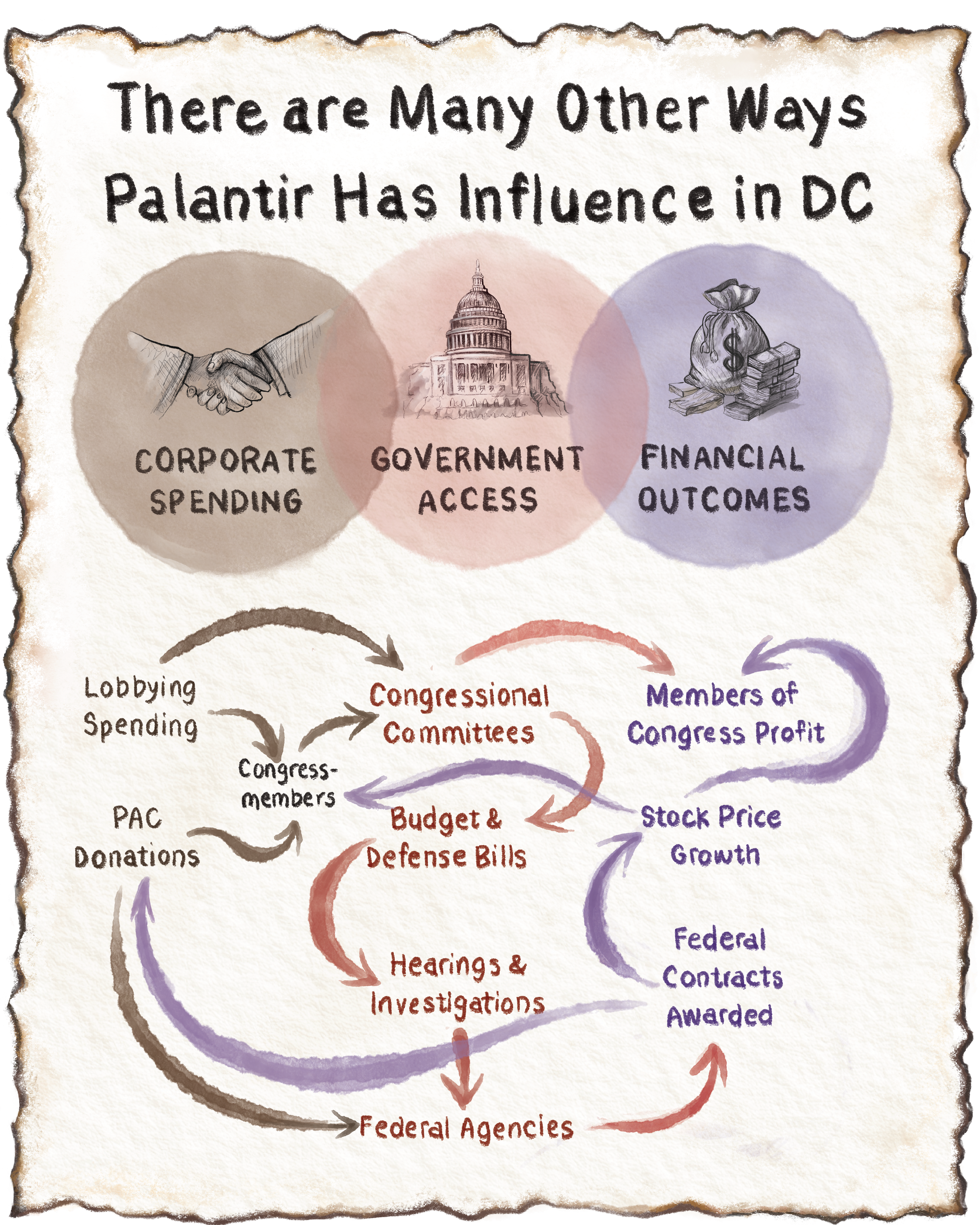
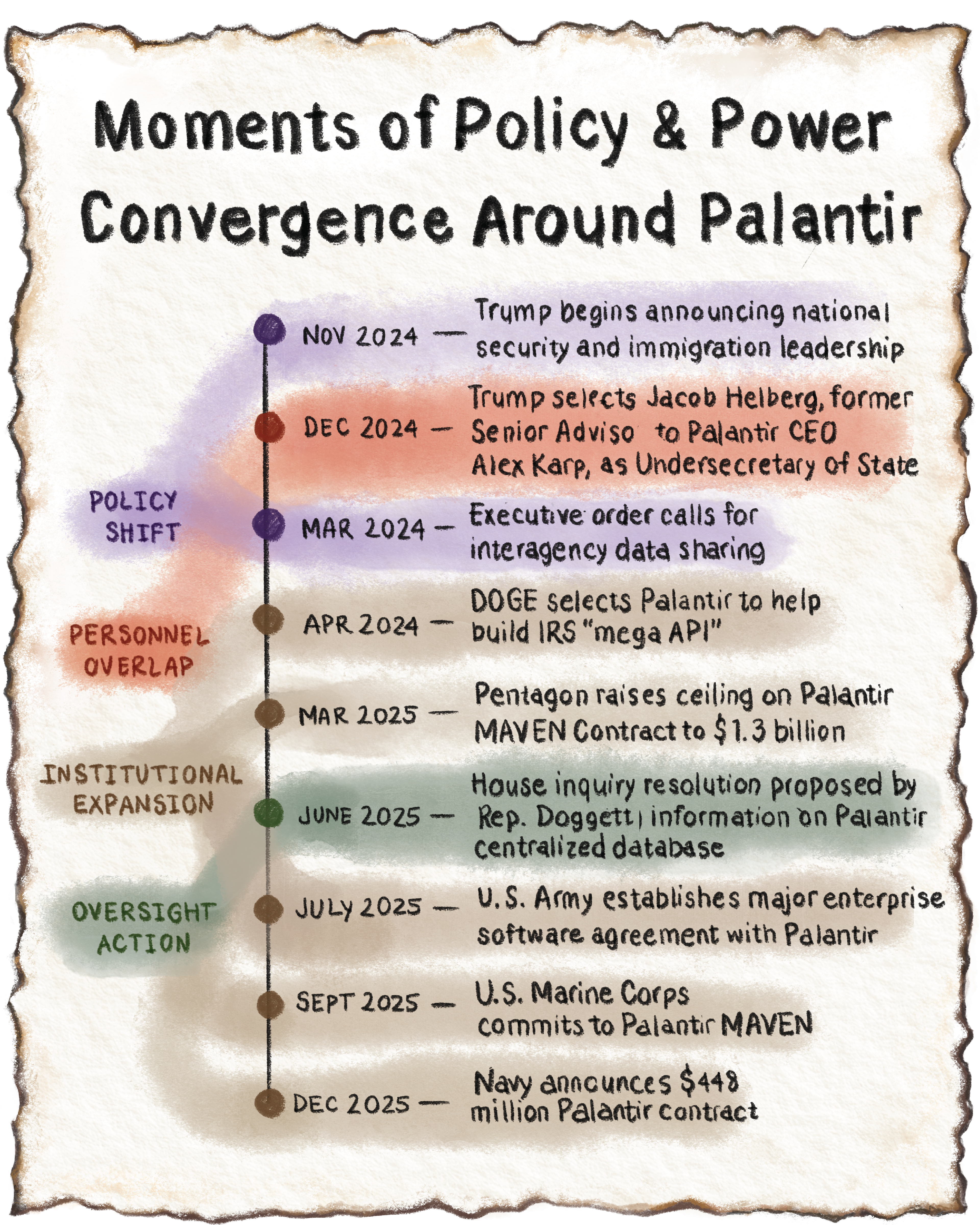
As a contract data journalist and illustrator for Quiver Quantitative, I collaborated on an investigative story exploring the financial ties between Congress and Palantir stock. I created four data visualizations and an editorial illustration to make complex political and financial data more accessible.
I built the initial data visualizations in R, created the illustrations in procreate, and the graphics in Adobe Illustrator.

The Process:
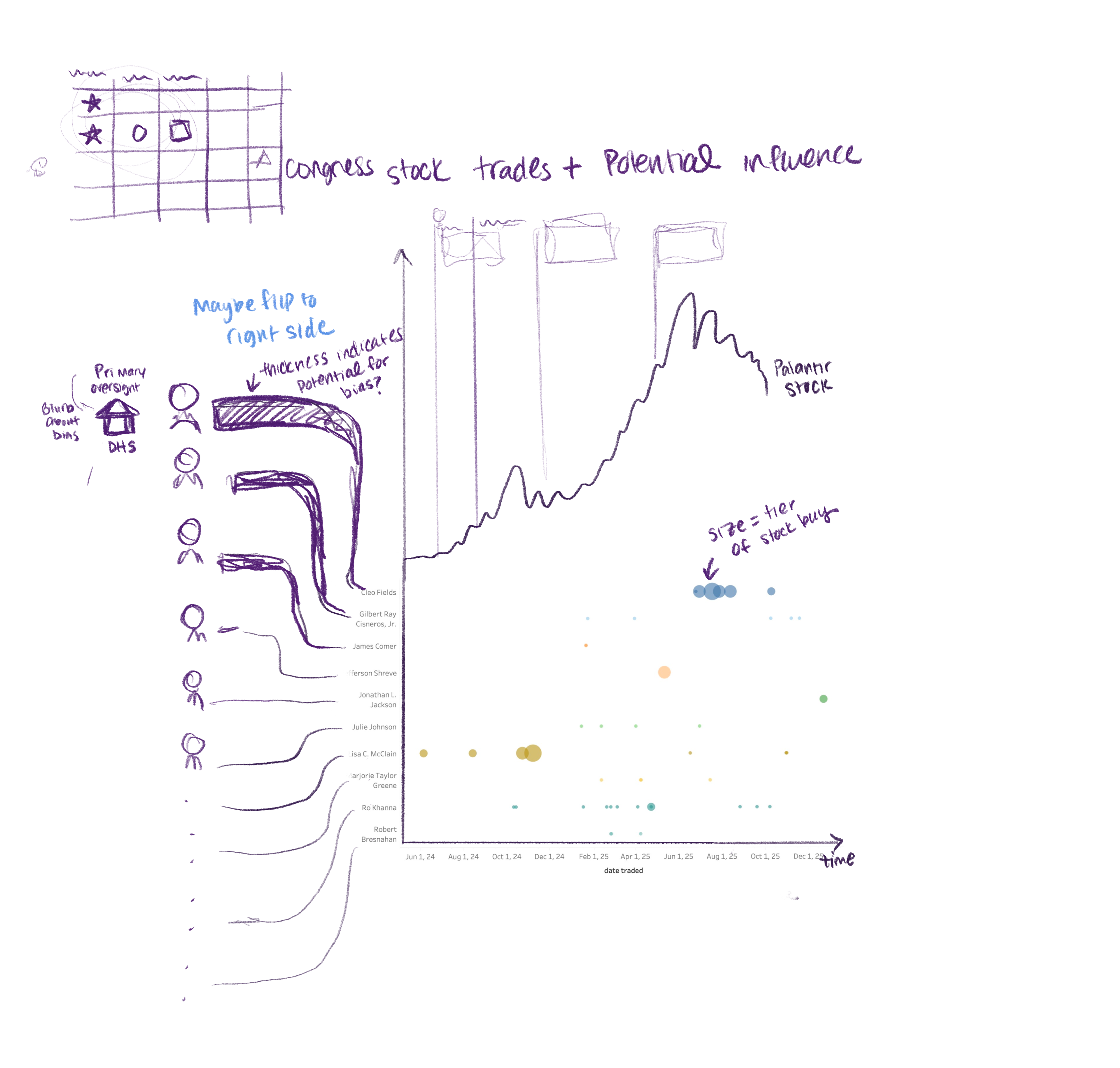
I started with a .CSV file of data and used a combination of R and tableau to generate initial data visualizations.
It was challenging to decide on the number of visualizations required to effectively explain the story content while assessing the balance of numerical vs. explanatory information contained in each one.
How much granularity in trade data is necessary to understand each congress member's influence? What does the committees each congress member is on say about the incentives of their trades?
I wanted to create a clear visual story of the intertwined incentives between congress member corporate spending, government access, and financial benefits without overwhelming the reader with extraneous numbers.