How Do People Choose their Picnic Spot in Piedmont Park?
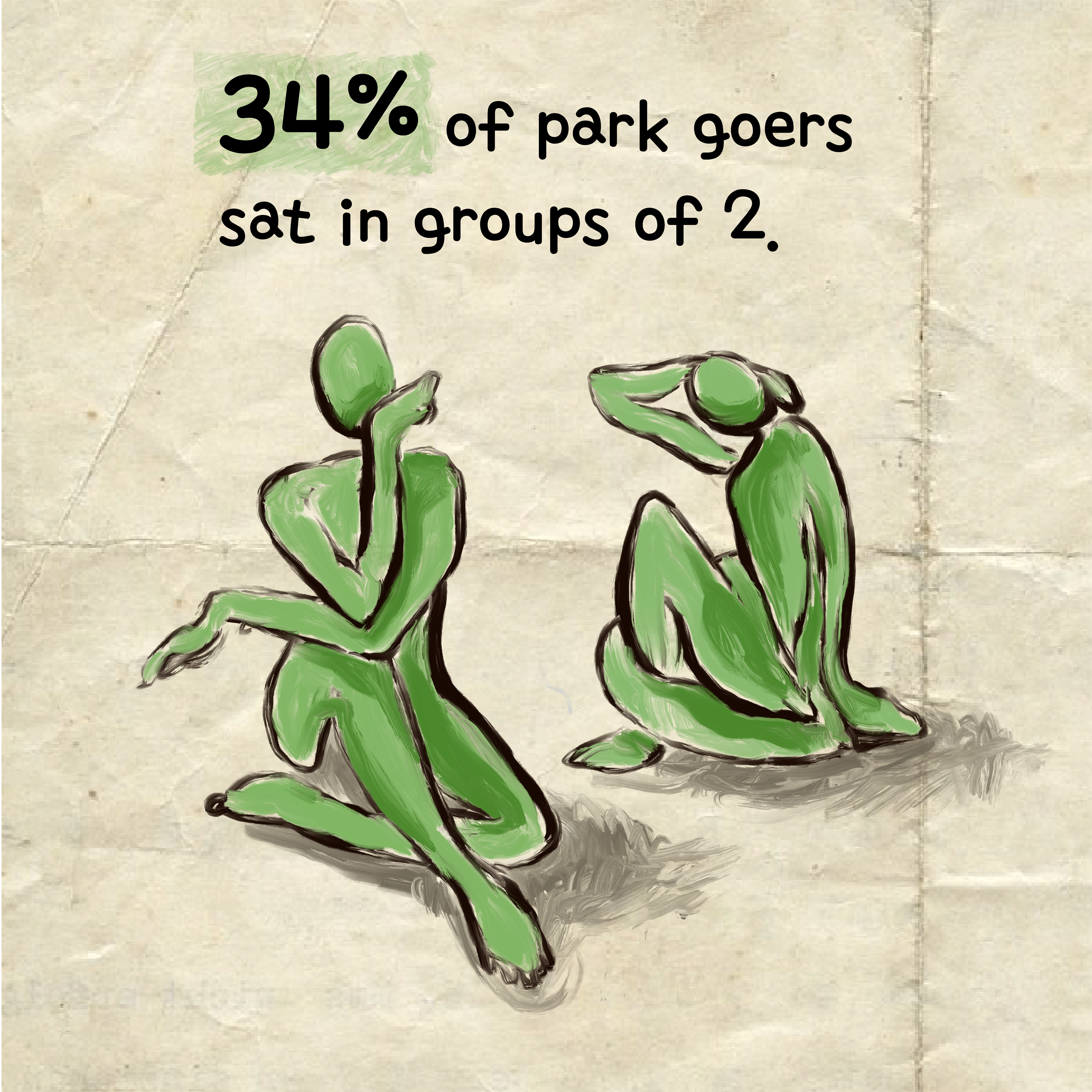
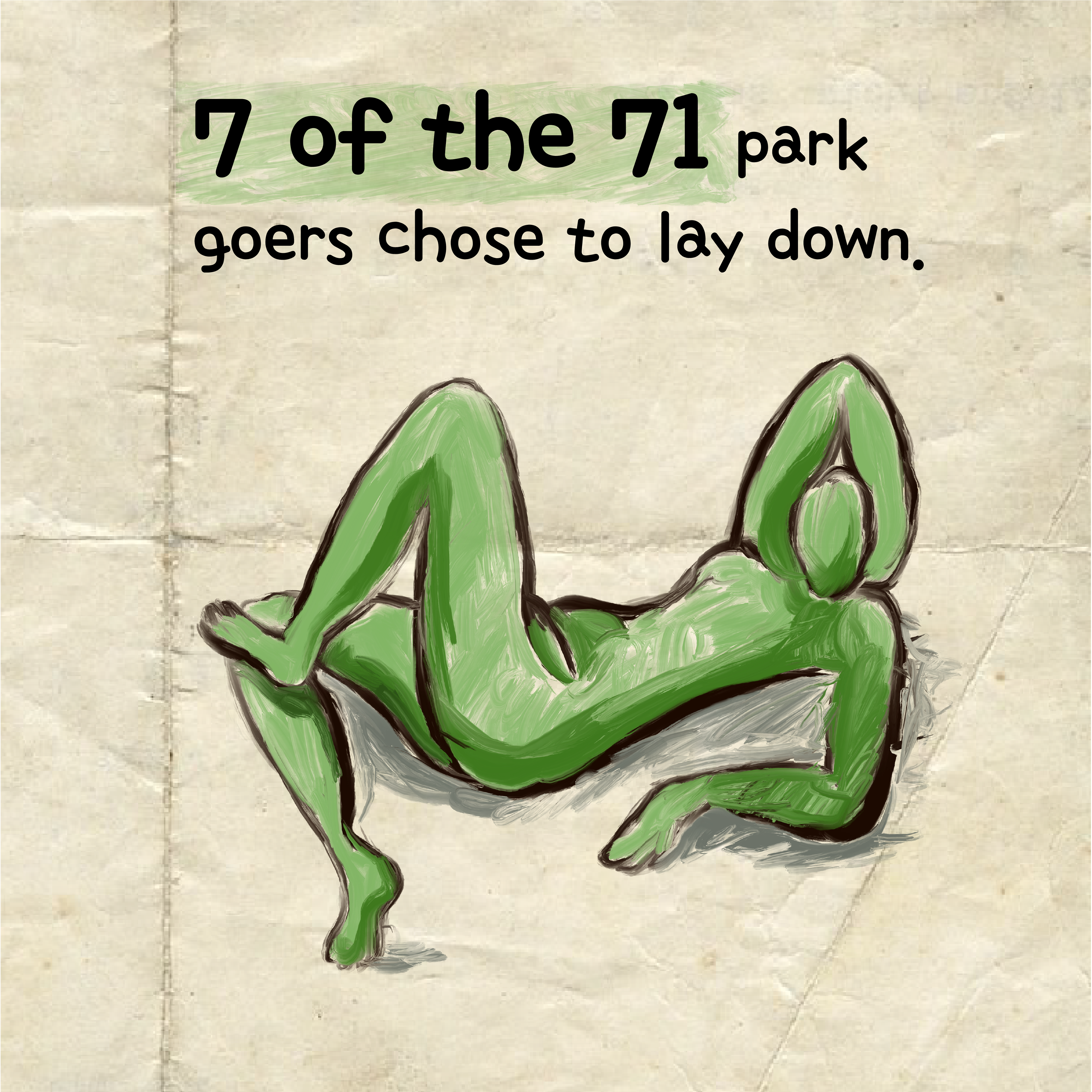
To answer the question, I collected data on seat position, shade covering, and group size from 71 picnic goers in Piedmont Park.
I improved upon a previous version of this project to create the more inclusive and engaging visualization shown above. To enhance accessibility and clarity, I increased text size, added summary text panels to highlight key takeaways, and established a clear text hierarchy using bolding, font size, and capitalization. I also redesigned the symbol representing a park goer to use a more intuitive and universally recognizable icon for a “person.” These changes were made with the goal of making the visualization more approachable and informative for a broader audience.


